Walgreens Homepage
While working on the Standards team at Walgreens, I was responsible for researching and creating redesign concepts for the Walgreens.com homepage.
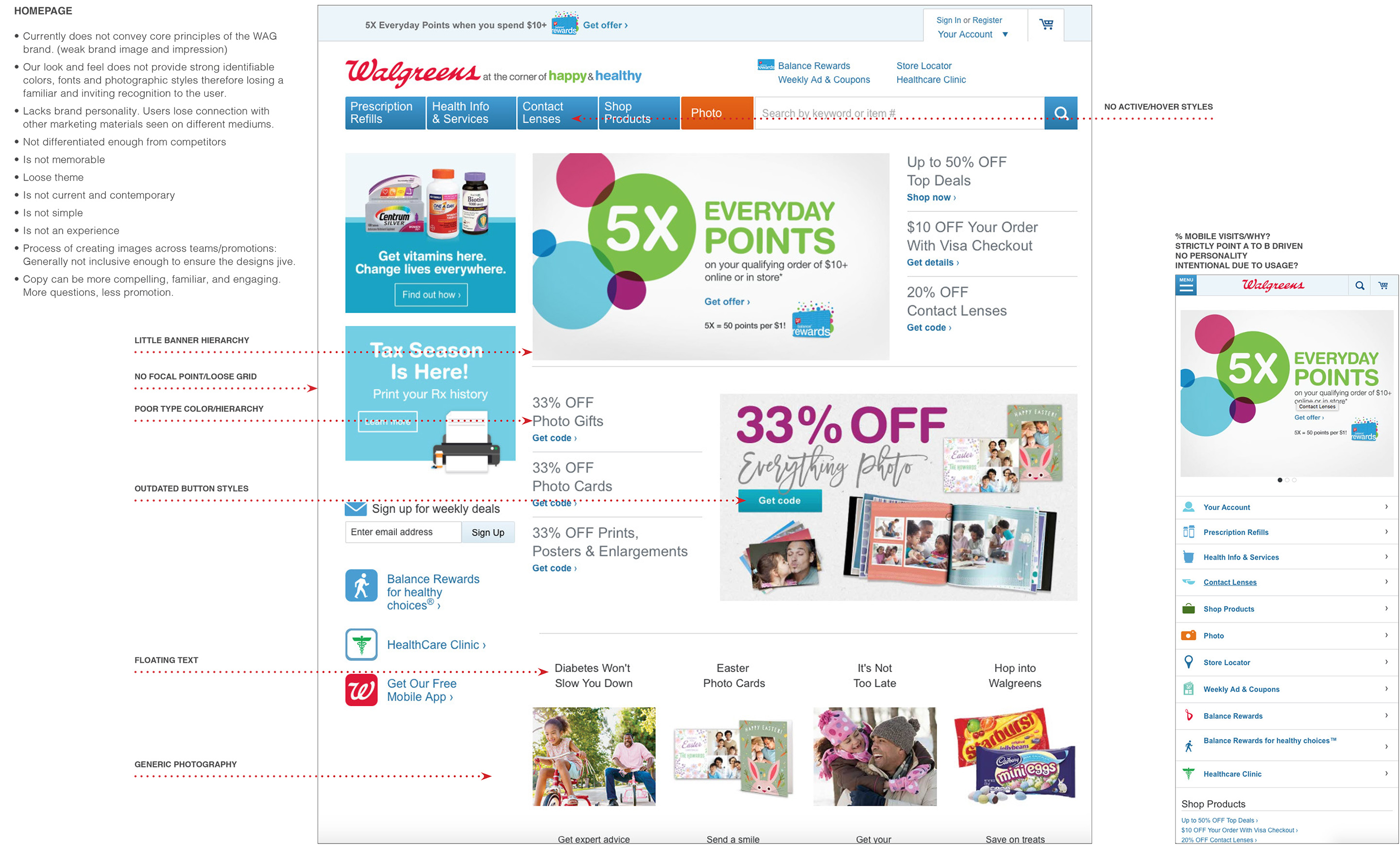
I studied the site in its current state and performed an audit of our current architecture and design along with our top competitors.
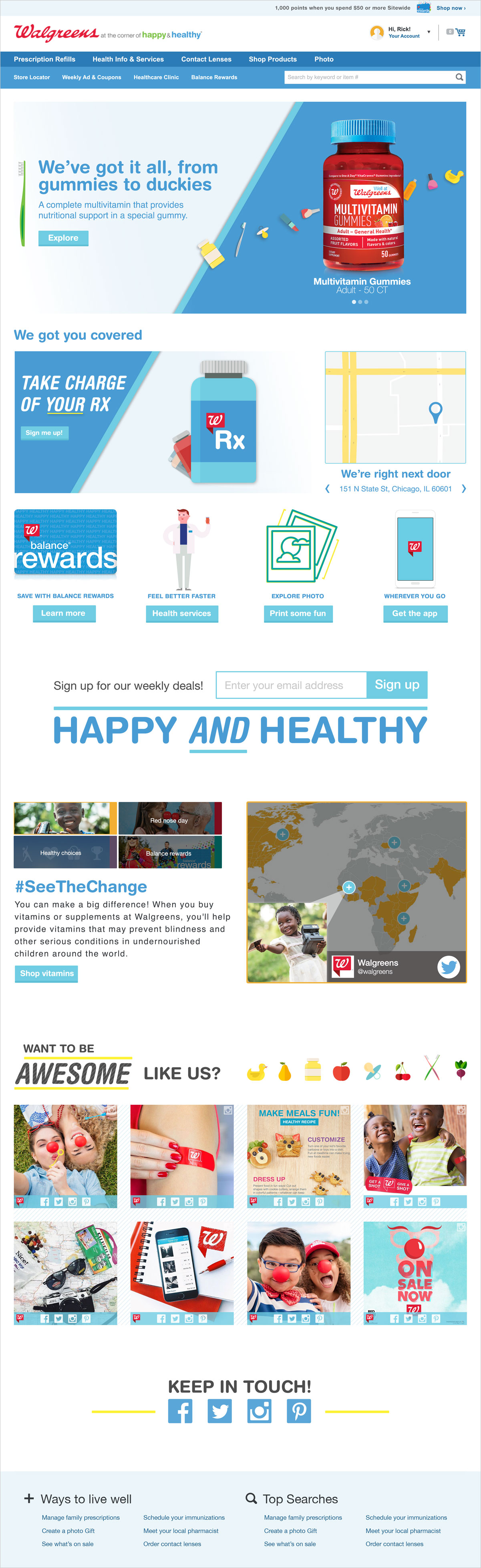
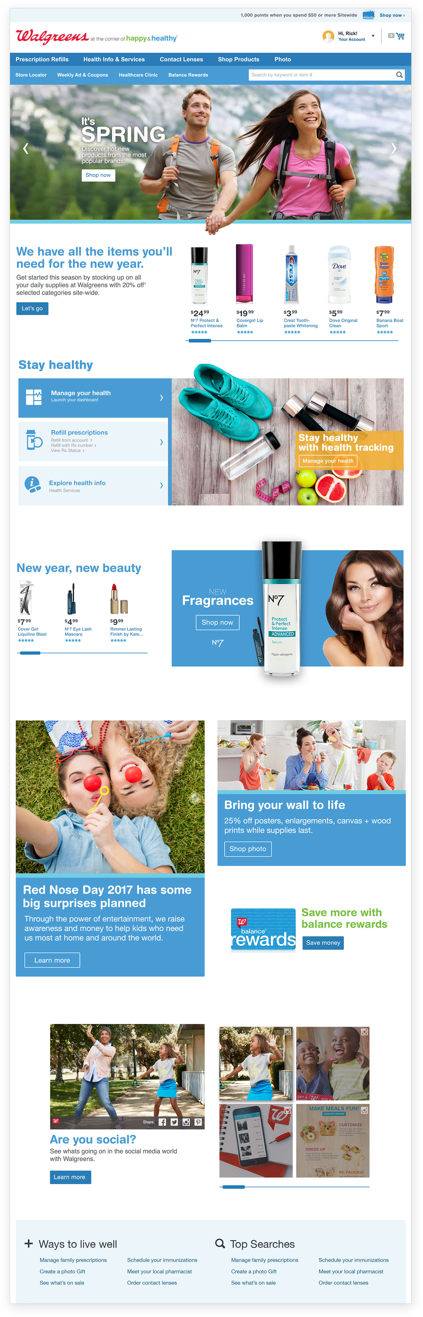
The new Walgreens website would have to provide our customers with a playful, yet memorable experience. I wanted to get away from bombarding the customer with deals and offers, and instead present them a linear story in which they are able to explore deeper about each section at any time. The new site offers straight forward paths to accomplish main user goals while playful visuals and colors leave a positive lasting impression on our target audience.
Discipline
•UX/UI
•Redesign
•Research
•Information architecture
client
Walgreens
objective
Redesign the Walgreens.com homepage.
Initial Concepts
Each version focuses on a connecting with the user in different ways. I explored possible versions of the homepage focusing on vector graphics, lifestyle imagery, and a controlled color palette.

Final direction
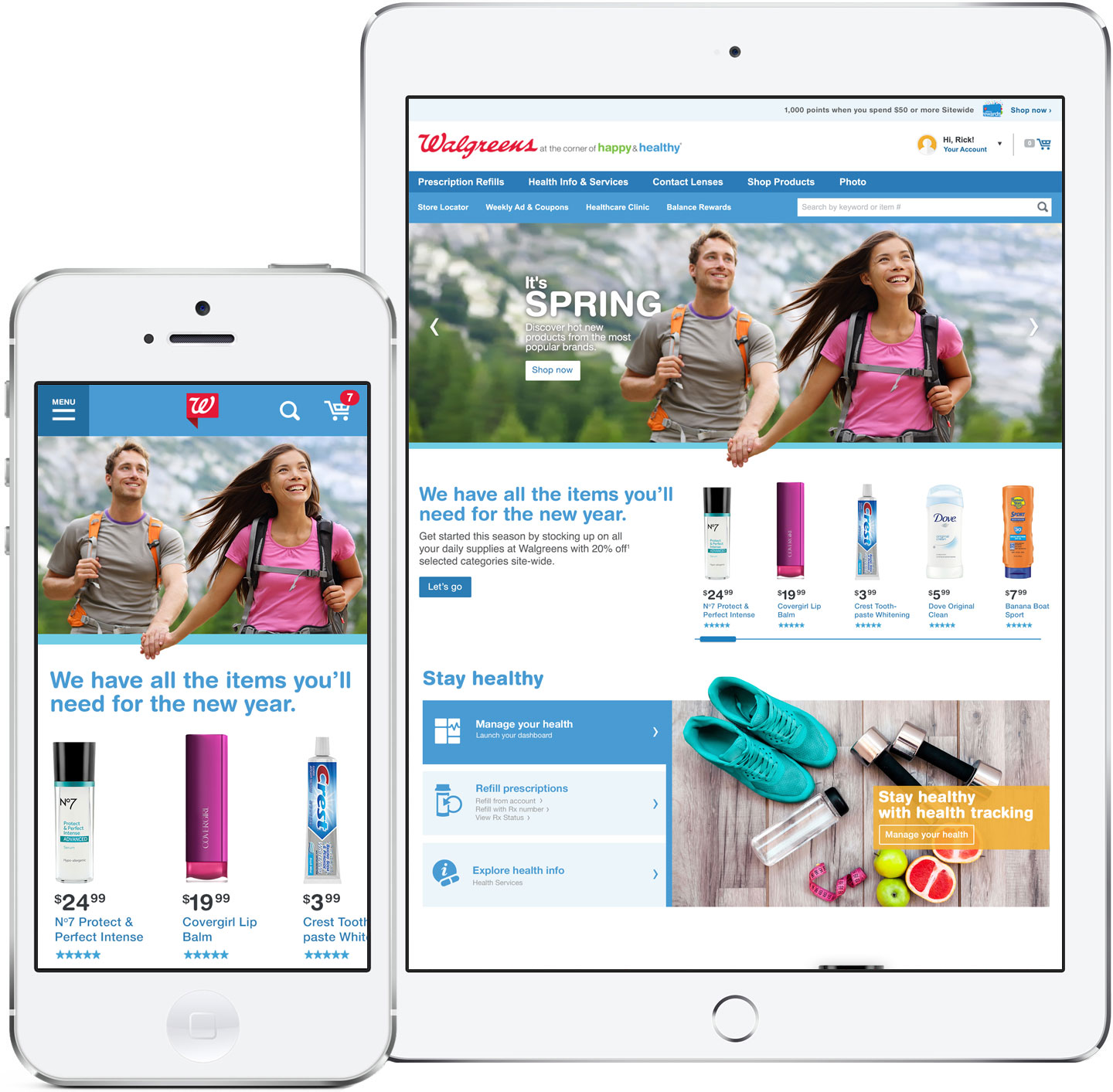
The most effective solution was to merge lifestyle images with functional and clean calls to action. This keeps the user engaged and also offers direct paths to the main user goals.

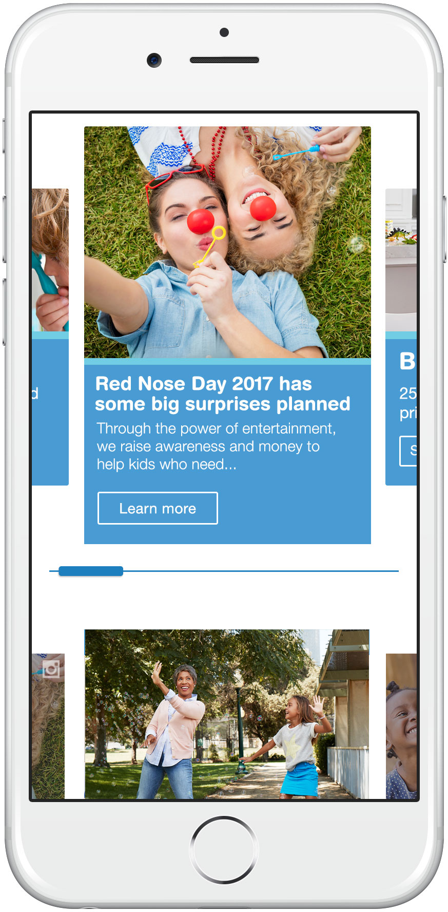
Optimized for mobile
The site now has an experience that is not lost for mobile users. The content and functionality has been optimized to offer the most effective paths to the main content of the site.