Racquet & fitness center
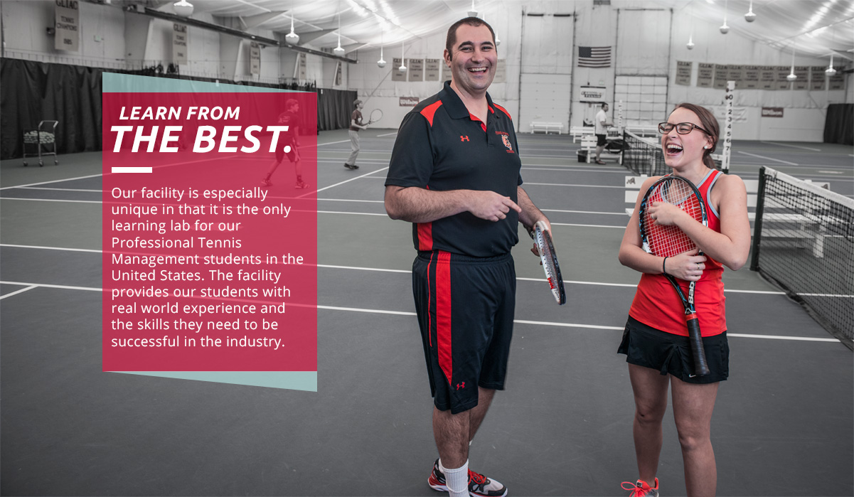
The Ferris State Racquet and Fitness Center houses one of the highest regarded Professional Tennis Management programs in the United States and is the only tennis learning laboratory in the country.
Conversion of prospective students into the Professional Tennis Management Program was being diminished due to the outdated branding, design, and advertising of the facility and program.
Our task was to create a new brand that visually conveys the facility’s value within its competitive environment.
During this 9 month long project, we devised a new branding and design strategy that statistically increased conversion among prospective students into the facility. The visual representation of this brand now mirrors the quality of the Racquet & Fitness Center and Professional Tennis Management program.
 view live site
Discipline
•Dynamic branding
•Information architecture
•Web design
•Front end development
•Content management
•User interface design
•User Experience design
•Art directing photography
client
Professional Tennis Management Director / FSU Racquet and Fitness Center Manager
objective
Create a new dynamic brand experience and web presence for the Racquet and Fitness center that displays the facility’s value to its current and prospective audience.
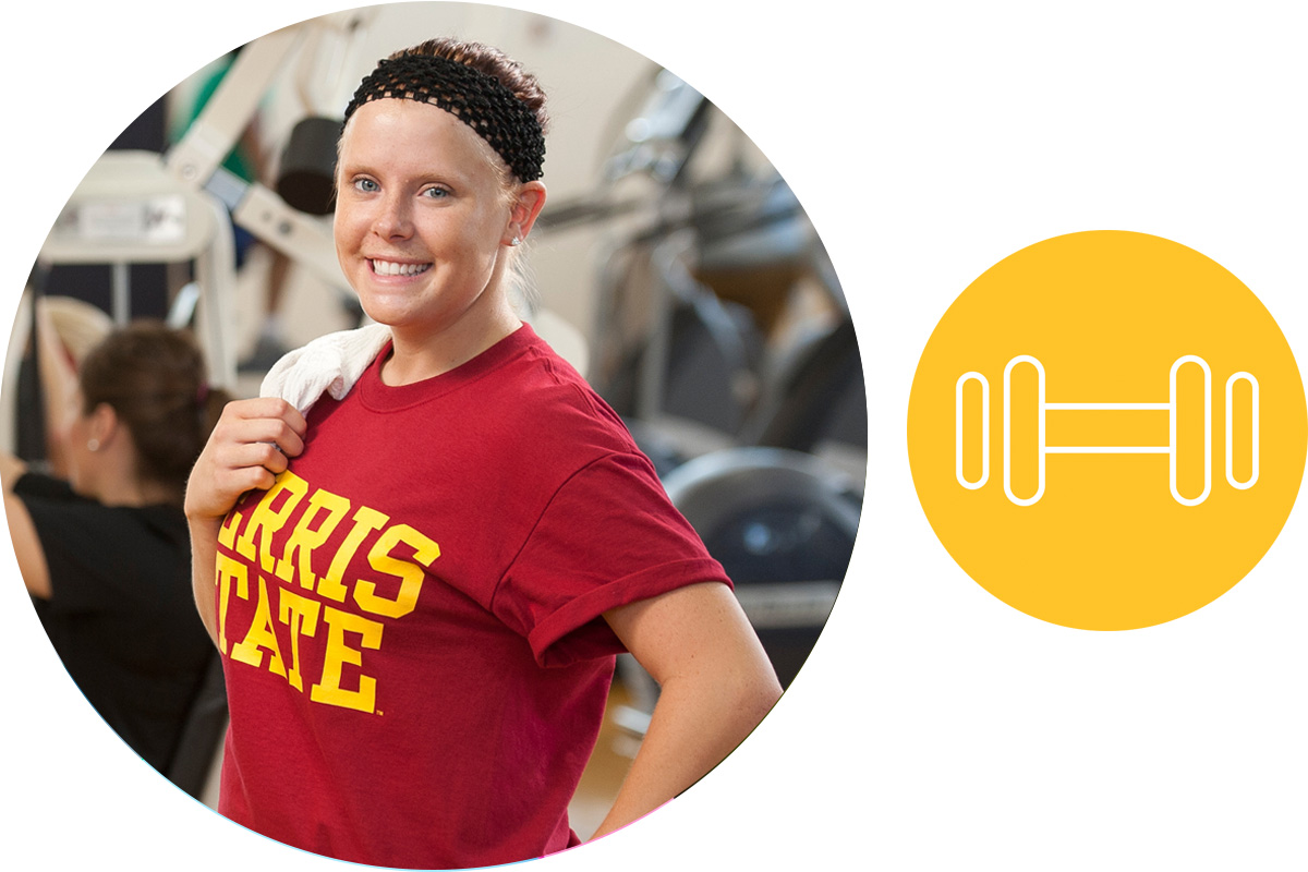
identifying the users
Ferris community member
“I want to take a fitness class and use the workout area.”
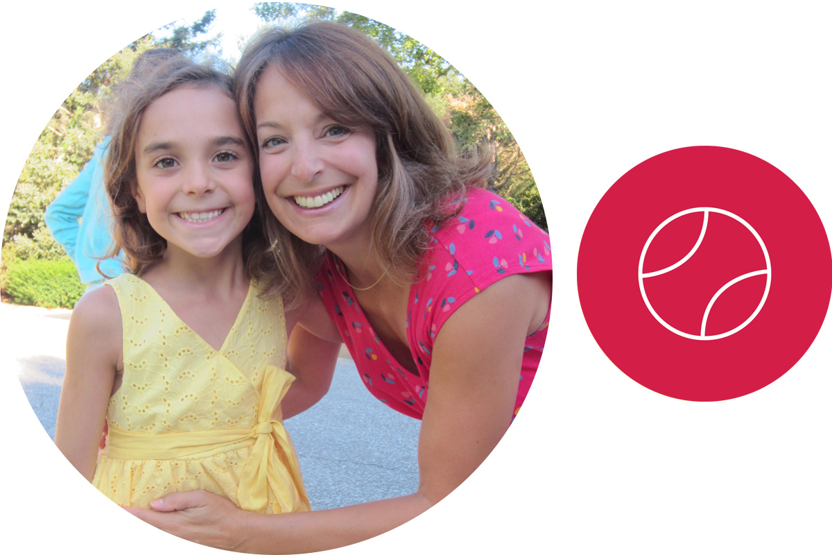
Parent of potential camper
“I want to learn more about the tennis camps for my daughter and how to register. I need to know why I should choose this facility over the local school camp.”

Potential tennis management student
“If I decide to go into the Professional Tennis Management program, I want to see where I am going to spend most of my time and what my options are.”
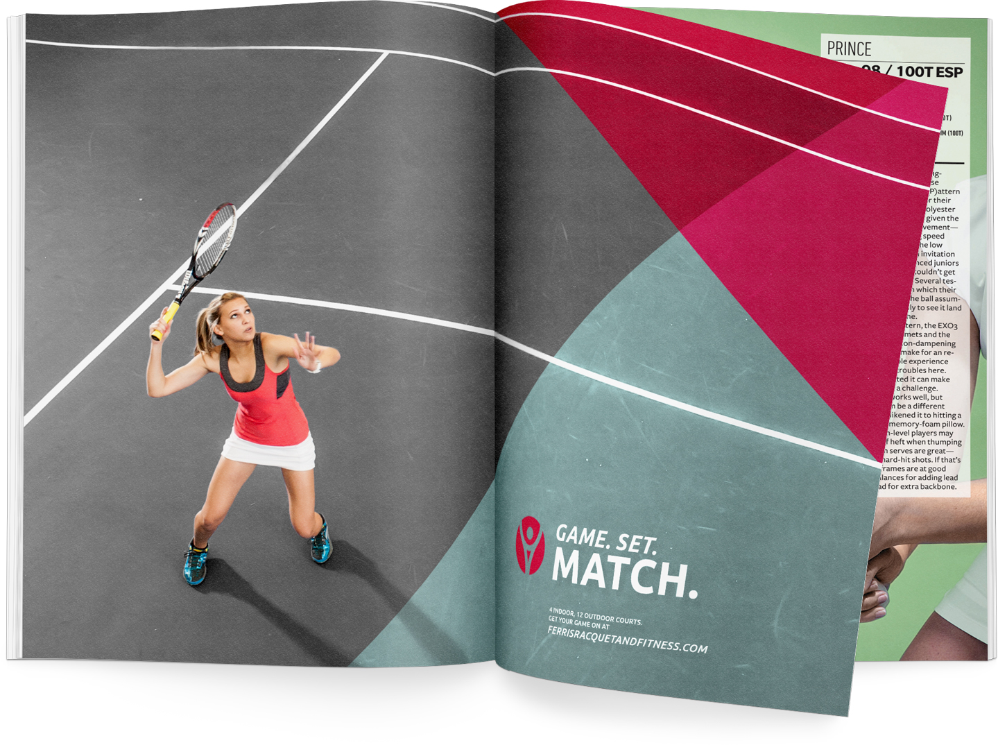
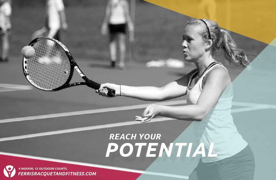
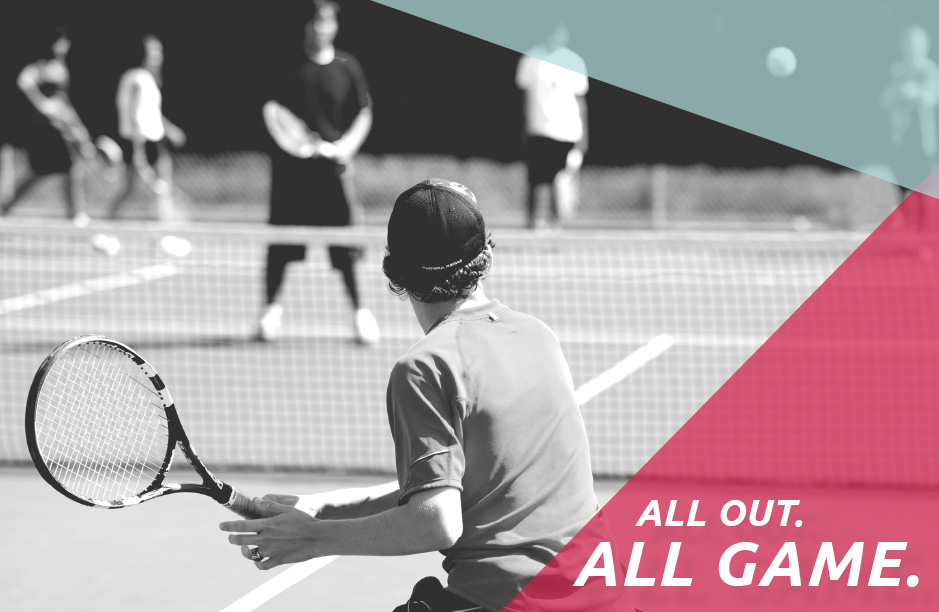
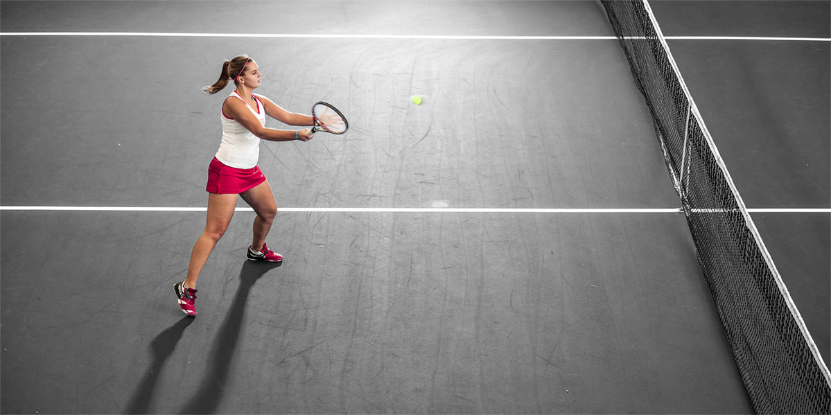
Capturing energy
Active photography is used to entice potential students of the facility. Many of the images show a competitive edge, but maintain a playful conversation.
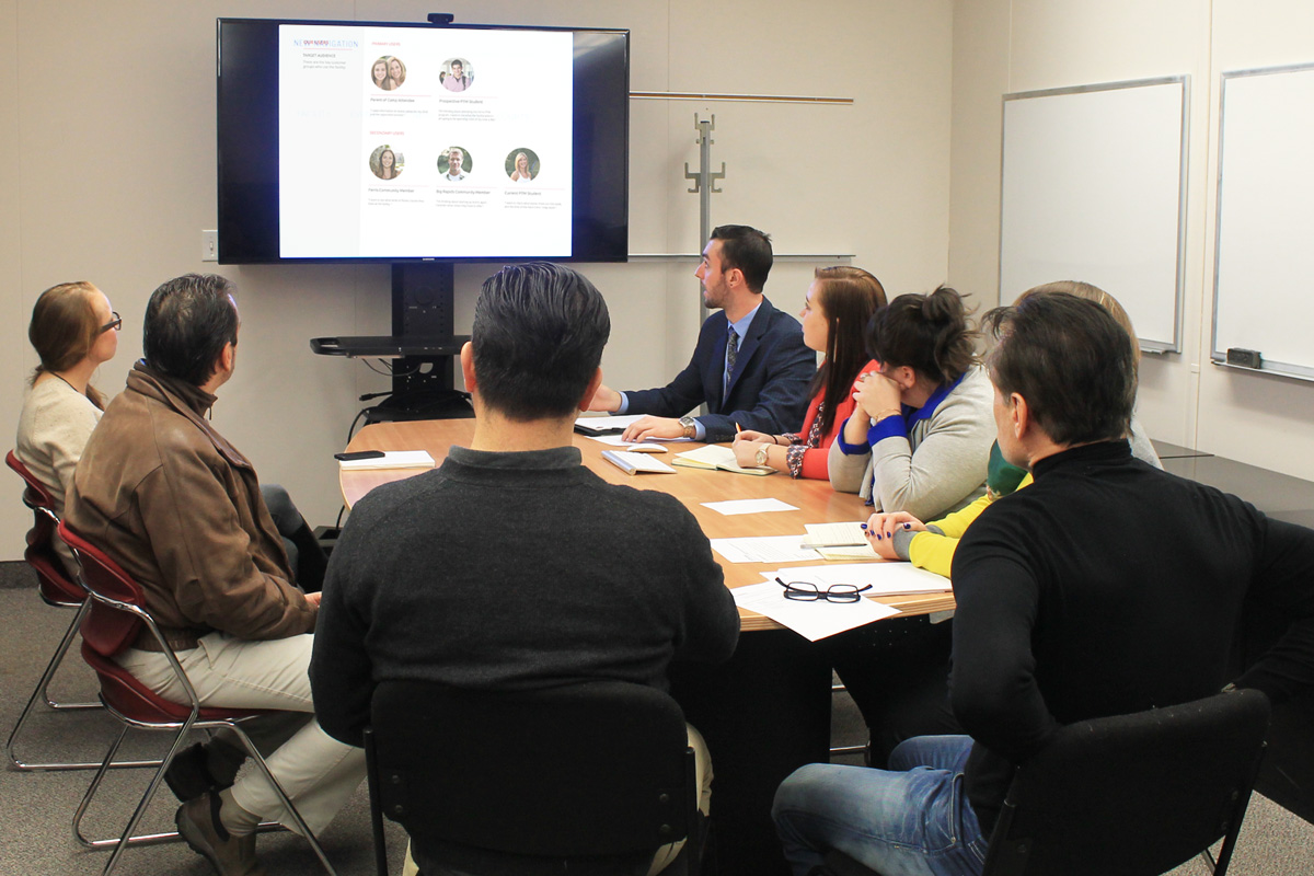
client communication
We presented our client with a proposed solution to the branding issues of his facility, along with the next steps to take in order to effectively address them. Every step of our process required a sign-off from the client and meetings to go over any issues.
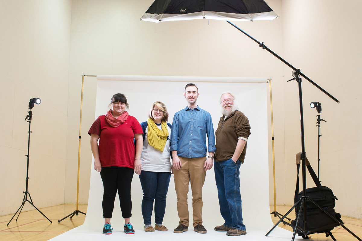
not a single stock photograph
We hired and art-directed a professional photographer to capture the values of the Racquet and Fitness Center visually. All of the images used on the website are original.
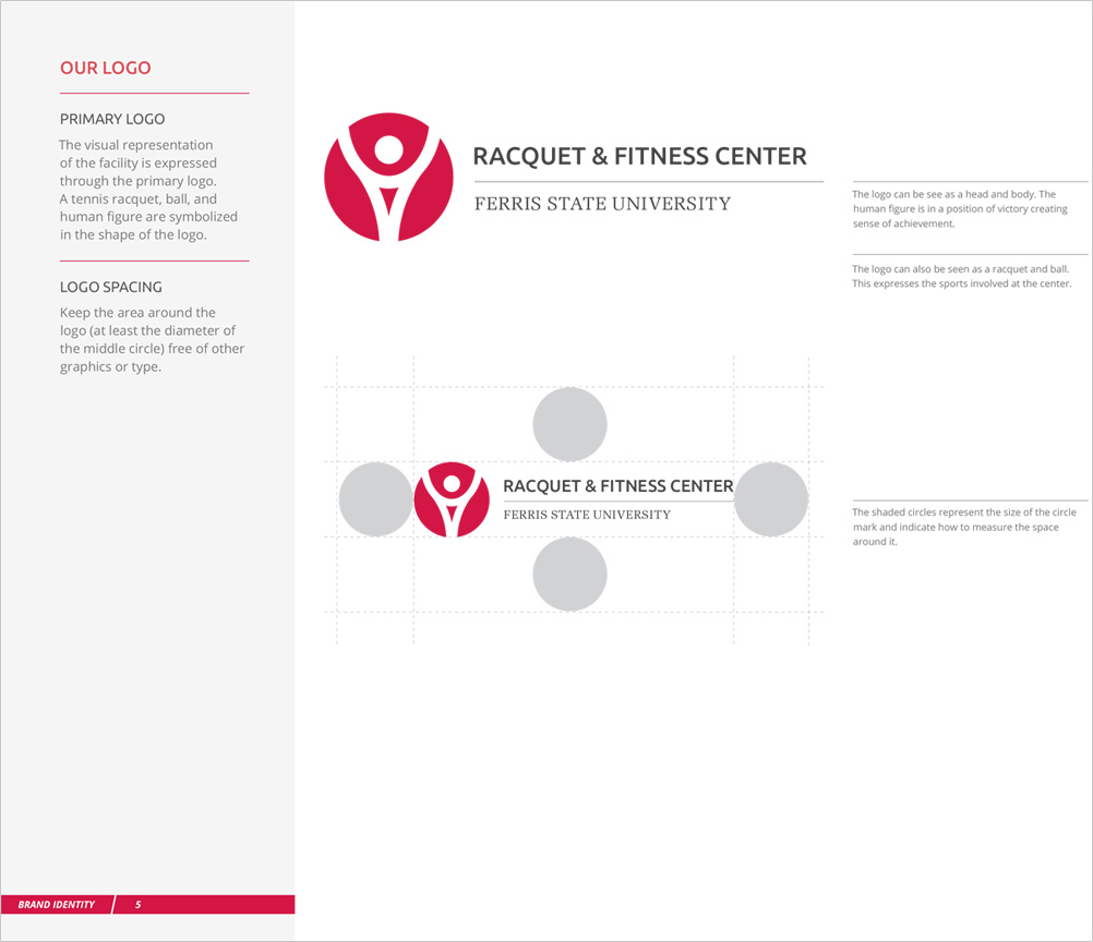
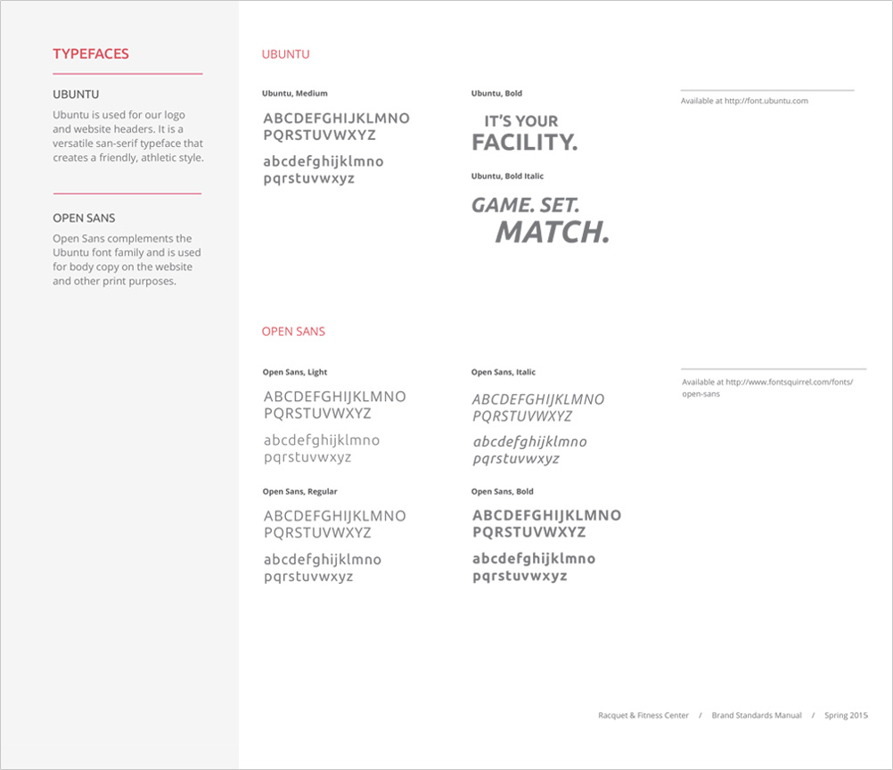
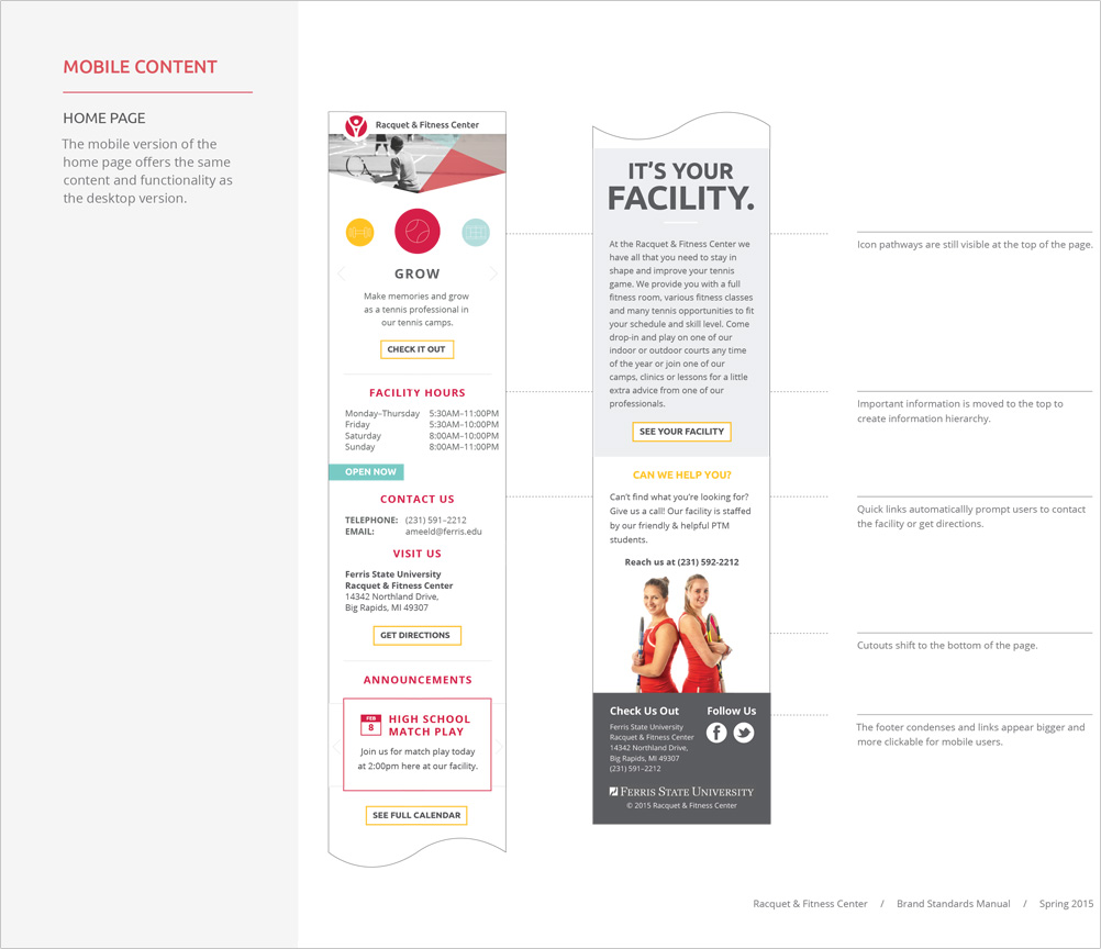
Consistency
We created a Brand Manual for the facility so the standards we created will be followed after all the files are handed off.
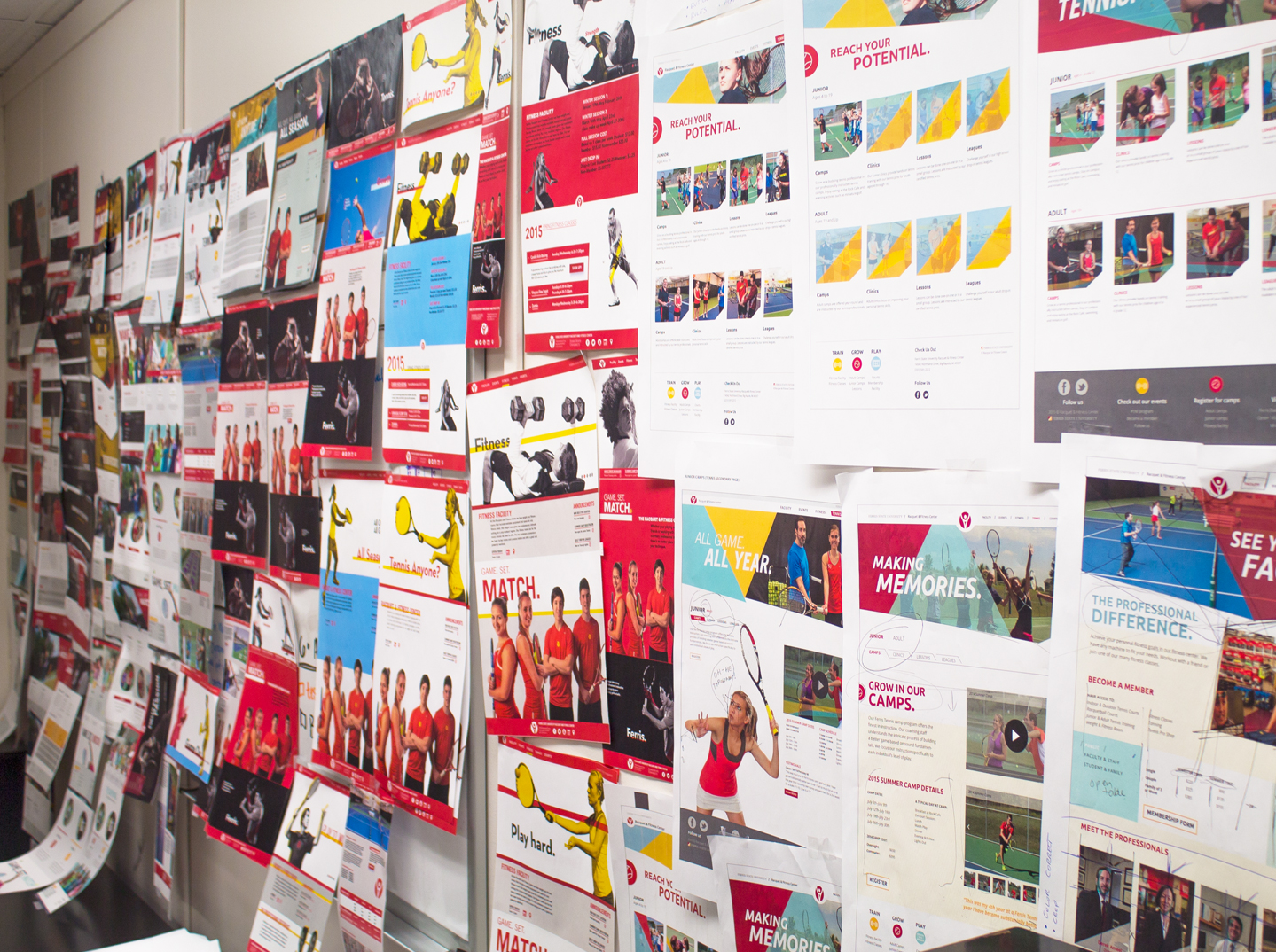
its all about the process
Along with the other planning phases of the design process such as creating site-maps and wireframes, we produced many different visual directions in order to find the best fitting solution for the facility.
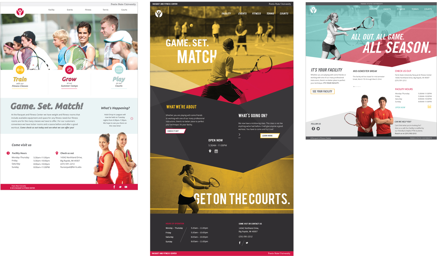
previous concept directions
Three directions were shown to the client for a final selection, each were designed to specifically target a different primary user. We created a middleground between the first and third direction due to the Feedback from our client.
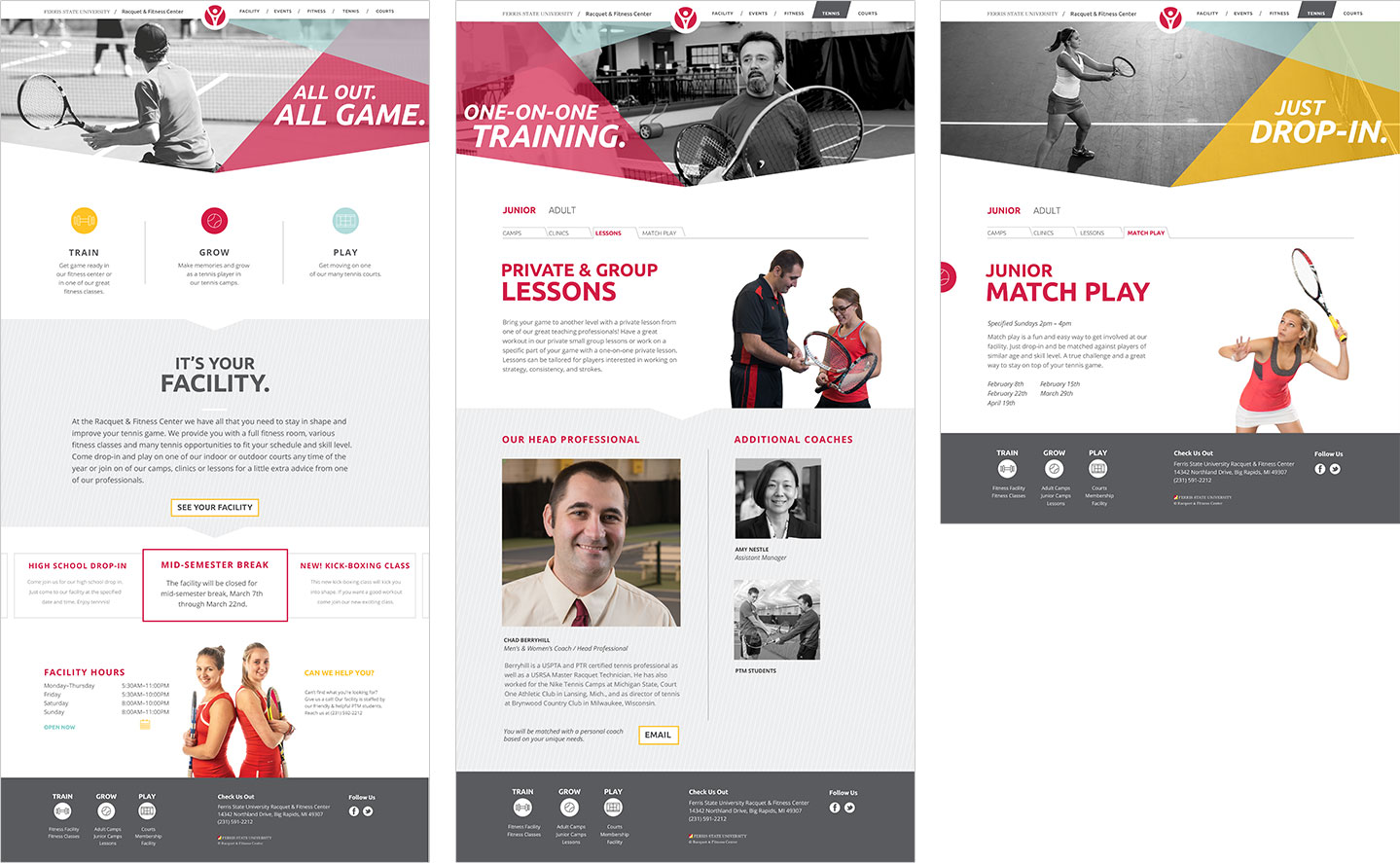
Applied feedback
After implementing the last of the feedback we created the final prototypes for the website before development.