The National Park Service
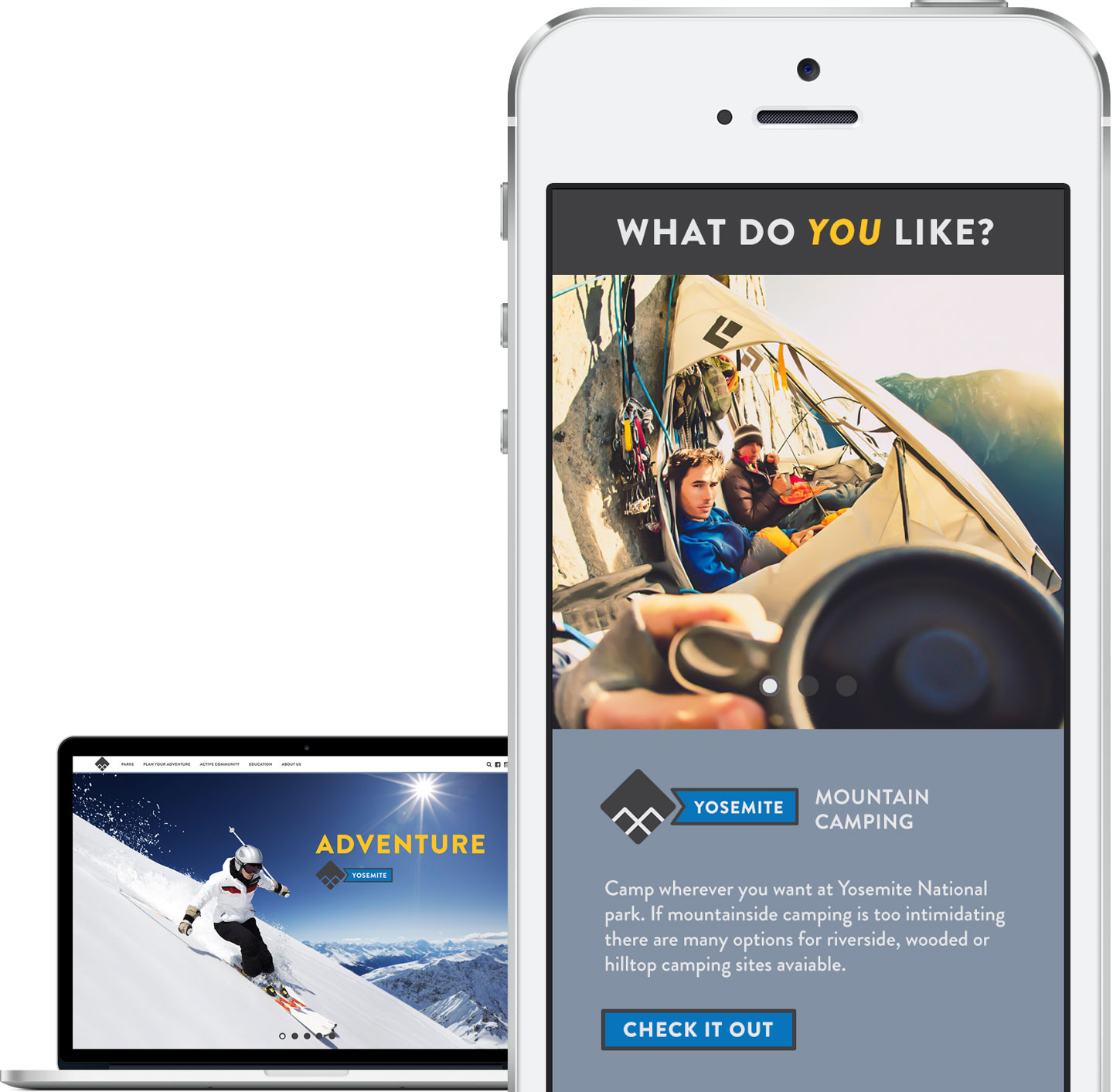
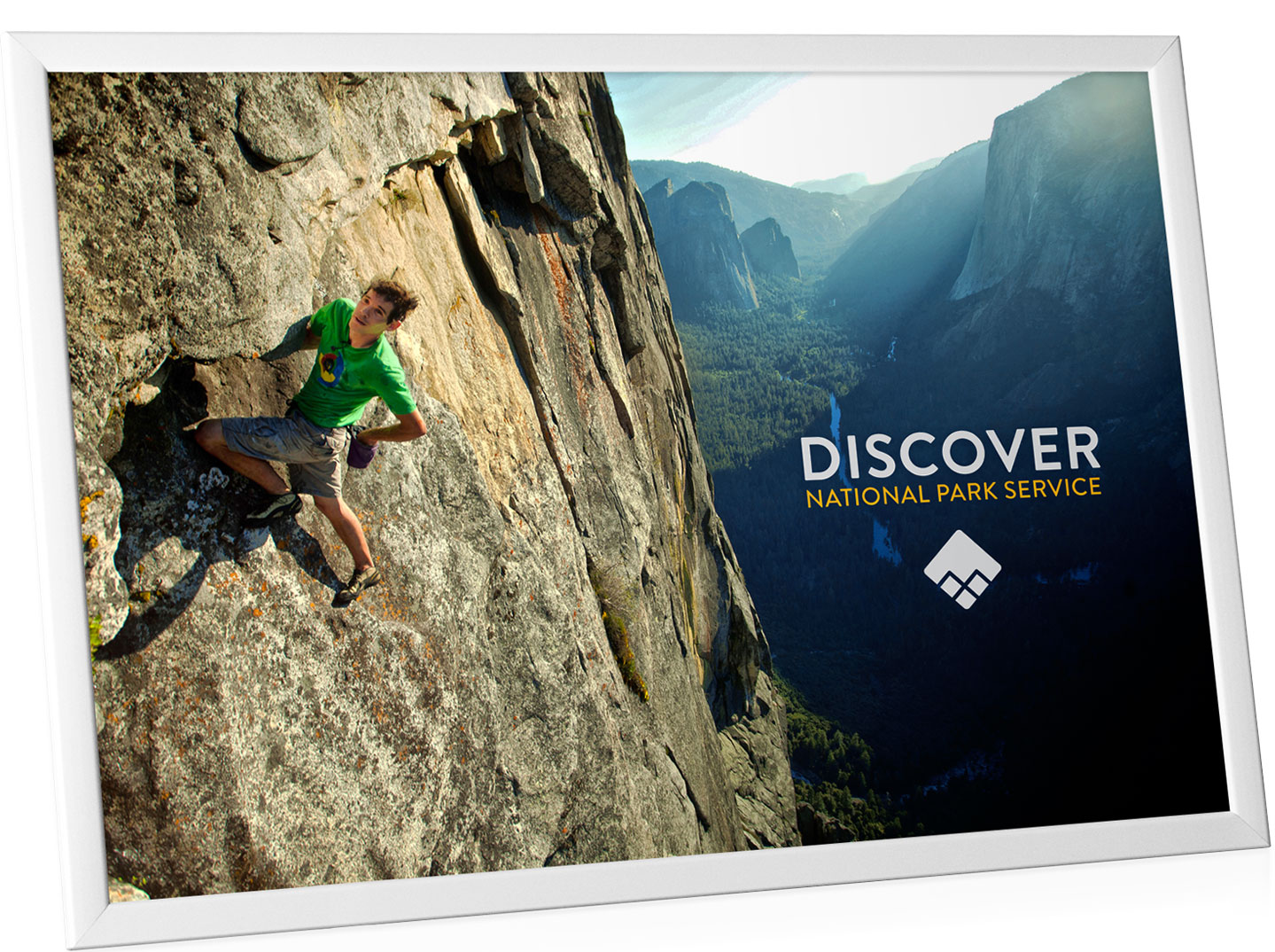
This project is a rebrand of The National Park Service. The brand needs to introduce the millennial generation as users to the National Parks in order to keep the parks alive as the current audience demographic changes. This new positioning of the NPS coincides with the 100th year anniversary of the service.
This is a real project that Grey Advertising has been working on this past year. I wanted to see how my solution relates to theirs, you can view the new campaign they came up with here. Or you can check mine out here. I decided that the best way to introduce the parks to the millenial generation is to display them as the real adventure and experience they are.


Discipline
•Dynamic branding
•Extensive research
•Case study
•UX / UI
•System interaction
•Advertising concepts
client
National Park Service: Department of the Interior. Nps.gov
objective
Revamp the NPS brand to target a new age demographic of users and address digital and environmental consistency throughout the brand.


creating a new identity
The current logo works well digitally and environmentally to convey the core values of discovery and adventure. The logo shape and meaning is based off of an ancient symbol called a Jumis, which represents prosperity, good fortune, and harvest.

adaptability
The way The National Park Service is displayed must always continue to adapt in order to stay relevent as a business.
